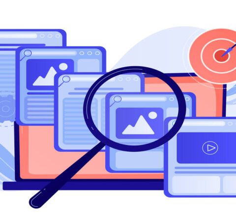
5 UI design Mistakes that are Killing Your Conversion Rates

Always be sure to not follow these common UI Design patterns on your site.
A website’s success is measured by many factors. UI Design is one of the many integrations which allow a website to flourish. Good UI can lead to pleasant experiences while bad UI can generally appear to be looked at as unpleasant. So let’s find out what the 5 UI Design mistakes are today and how you can avoid them.
5 UI Design mistakes to avoid
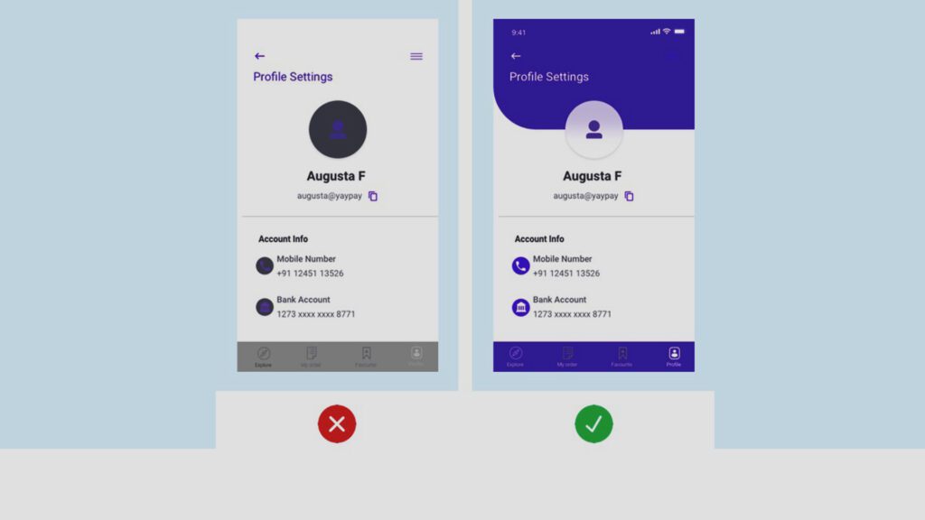
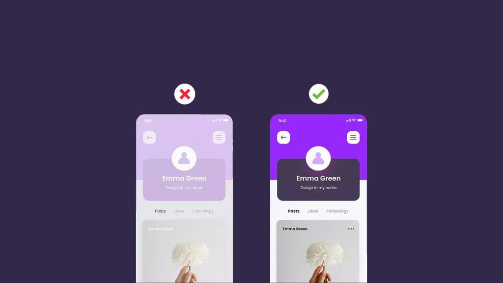
- Inconsistency amongst text, colors, etc.
In UI Design, it is important to remember that all elements need to be represented equally on each screen. Without consistency of text and color, users can notice what is trustworthy and what is not. To mention a few examples of inconsistent UI Design, a Header on a certain page is dark gray Montserrat with a 30px font size, the remainder of the subheadings should be the same color.
To be careful with consistency, plan ahead before the design phase. A style guide should come handy when thinking about the consistency of color and texts across all pages.
Yes fancy fonts may be pleasing to the eye, but oftentimes, designers have to remember that the same thing is not bound for everyone. Readability is absolutely a must, giving the user time to adapt.
- Confusing Navigation
The very first part of a website users are going to go to is the navigation bar simply to find where information is located. And if certain navbar elements don’t fall under the correct category, too many menu options, etc. It is highly vital your information is organized for users.
The correct use of headers and typography is important in navigation menus as well.
Unimportant links in the primary navigation menu – This is another common mistake in website navigation design. Irrelevant links to in subsections with no regard to what your target audience needs.
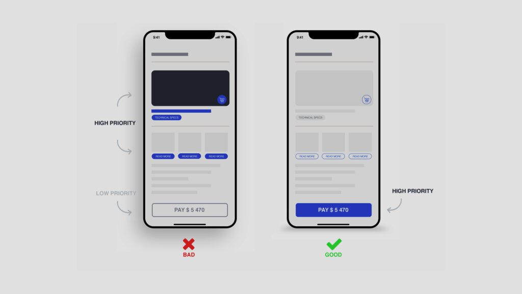
- Not using enough whitespace
One common UI Design mistake many are aware of is limited use of whitespace. If simplicity is the goal, then making use of more whitespace can be beneficial to your designs. If the goal is to think about the ux funnel in design, then whitespace can optimize the attention, desires, and actions of particular users.
White Space designs can be categorized into two types:
- Macro space – in the simplest terms, this term refers to the space between the main elements of a web page or mobile app, as well as the space surrounding these elements.
- Micro space – this term refers to small gaps within elements, like intervals between pictures, line spacing within the text, separators, etc.
The more whitespace, the easier it is for users to grasp key information. Visual Hierarchy is inevitable when there is enough whitespace. According to research, the appropriate use of whitespace between lines of paragraphs and its right and left margins can maximize comprehension up to 20%.
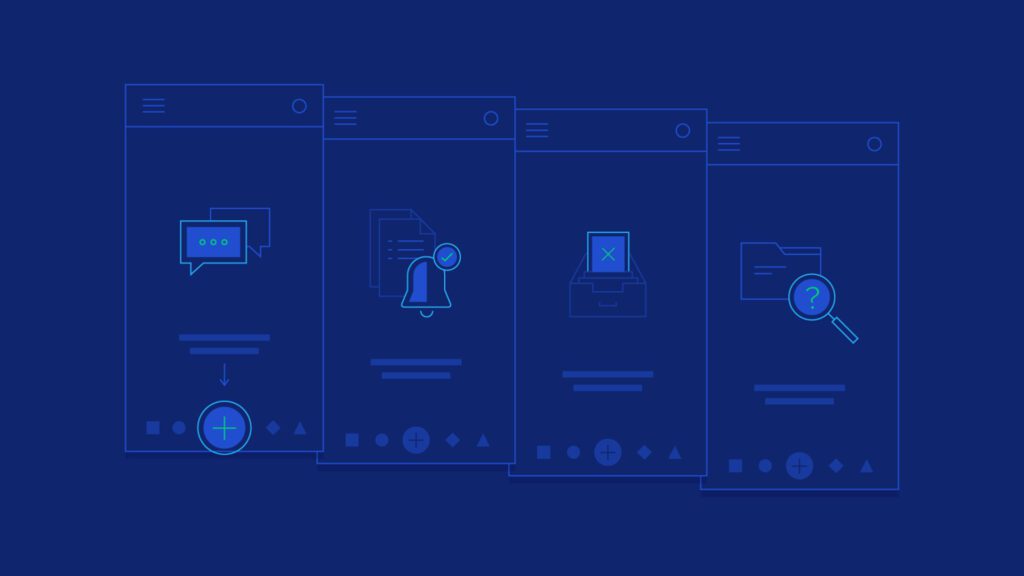
- Forgetting to label icons
Providing a label to each icon is important. Imagine you are the user of an app and see a camera icon in the middle of all the icons available, would you be able to guess what the feature is used for?
Not providing labels to each icon is misleading for 3 reasons:
- Commonly used icons like cameras, hearts, and chat mean different things on different websites and applications.
- Icons with too much detail like can lead to confusion and users have to spend more time on figuring out what they mean.
These days, users are bombarded with information on their devices. So it’s highly important to label icons so that users can figure out the information at first glance.
- Unresponsive Designs
These days, designers need to think about designing for various screens i.e. desktop, mobile, and tablet. Still, there are designers who only keep mobile design in mind. Mobile traffic accounts for about 50% of web traffic, but that means another 50% still comes from other sources like desktops and tablets.
If this UI Design mistake doesn’t sound relevant to you. Google released a ranking requirement in 2015, stating that an algorithm update prioritizes mobile-friendly sites. Using responsive design, you can save money by eliminating the cost of paying for a mobile site.
Conclusion
This blog has mentioned all the 5 UI Design mistakes that don’t lead to high conversion rates. Keeping some of these points in mind can be beneficial to any company’s products or services.
At GTECH, we strive to give our audience the right information so they can level up their digital enablement.
Related Post
Publications, Insights & News from GTECH