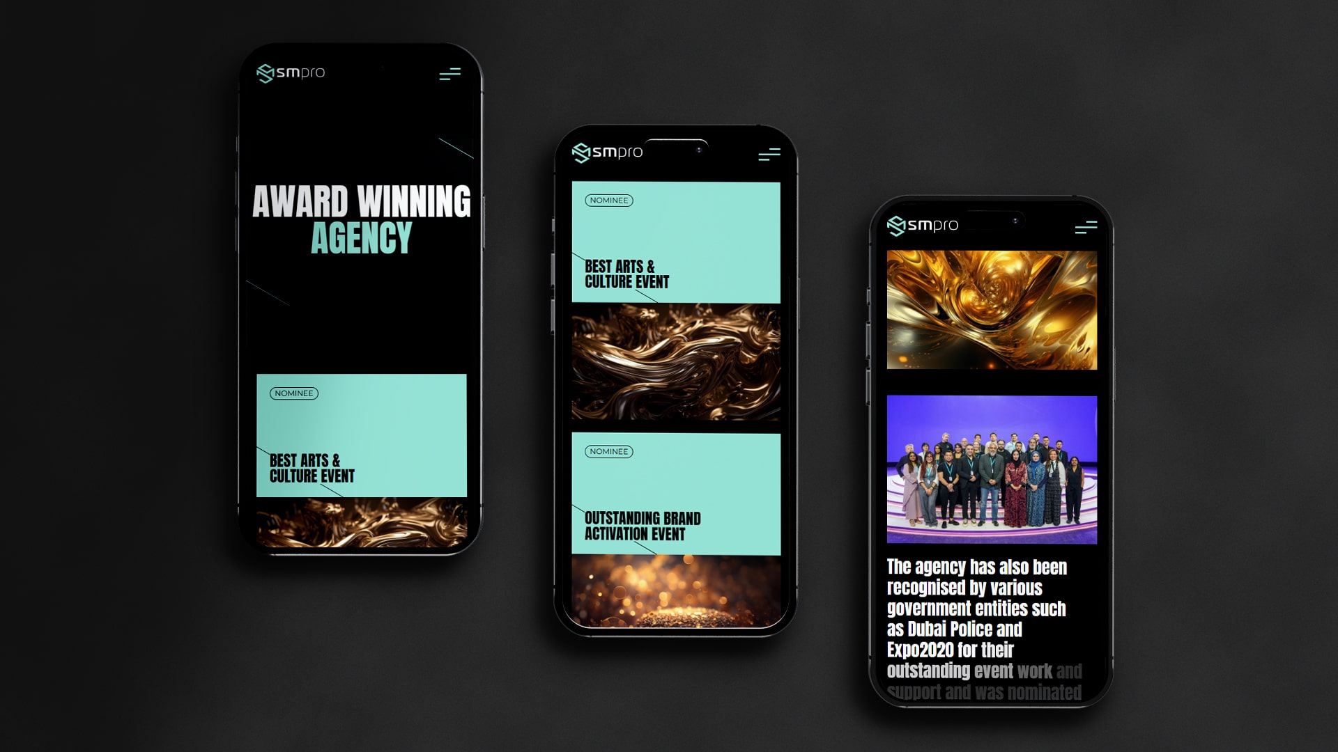
Web and mobile visual design have seen trends come and go but it seems like dark mode, though not particularly new in design, is here to stay. Why are brands and users drawn to this particular design and why have darker themes become a norm?
What is Dark Mode?
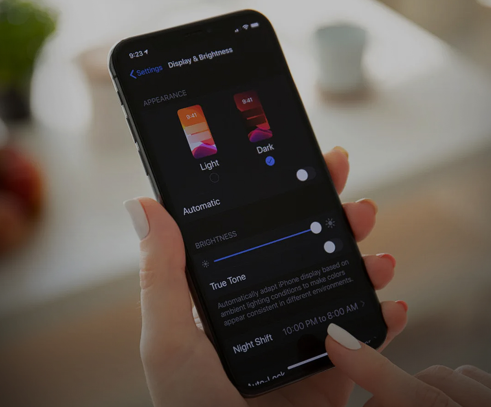
Dark mode UI design is a popular theme that inverts the traditional dark, black text on bright white backgrounds and instead places light-coloured text on darker backgrounds that include but are not limited to black. Also known as “night mode” or the “dark theme,” web design has leveraged this feature for mobile apps as well. With dark mode, app design has welcomed darker colour palettes that are pleasing to the eye, user-friendly, and offer an interesting user experience (UX.)
The Benefits of Dark Mode
Dark mode UI has become a crowd favorite for multiple reasons. This dark mode trend and dark mode app design, is ongoing in this year, in 2024 as well, because it is:
Aesthetics
Dark theme mobile UI is renowned for its aesthetic appeal. Dark backgrounds in both mobile apps and web pages are elegant and modern. With the right mix of color, curated elements are more memorable and stand out in dark mode.
Engaging
Dark mode app design is engaging. You can leverage a darker theme and use certain colors to guide users along your website or mobile app. Content stands out more with a dark background and you can create a captivating experience for users.
A More Comfortable Experience
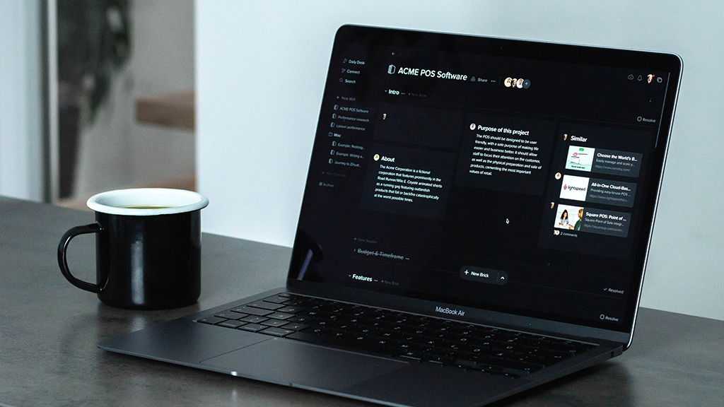
While there are still studies to be conducted regarding this advantage, dark mode UI design is said to help users use their devices for longer without straining their eyes or being overexposed to blue light. Many choose dark mode app design because they are able to comfortably work, study, or browse for hours in low-light environments.
Energy-Efficient
Studies have shown that dark mode app design can actually use less battery than its counterpart, light mode. In particular, dark theme web design and mobile app design is beneficial for devices with organic light-emitting diode (OLED) screens.
How to Incorporate Dark Mode UI Design
How exactly can you implement dark theme mobile UI or web design? When adapting this trend, keep the following in mind:
Dark Mode ≠ All Black
Having a dark theme does not necessarily mean having an all-black mobile app or website. Interestingly enough, you can opt for grey. Unlike pure black, grey has different shades to choose from that still look as sophisticated and work well with light or bright colours.
Think About Contrast Ratio
Finding the right balance and ratio of color contrast can actually make or break a dark theme. Either stick to color contrast standards or do in-depth research and testing regarding the contrast of different elements on your app or site.
Saturation Levels Make a Difference
For dark theme web design, saturation levels should generally be kept on the lower end of the spectrum. Unlike light mode, saturated colors can make content difficult to see and more strenuous to browse through. Keep saturated colors on light backgrounds and opt for light or pastel colors in dark mode.
Choose Colors that Communicate Your Brand
Remember, a darker theme is more memorable so make it count. Every color on a site or app should align with your brand and provide the best UX that you have to offer. Dive into color theory to properly communicate what you and your business are about.
Depth is Important
Even in dark mode, creating depth is vital to properly guide users along. With illumination and certain bright or lighter cues, you can create a visual hierarchy, highlight certain elements, and create order in a darker-themed app or web page.
Don’t Force the Dark Mode Experience
While you may be an advocate for night mode, not everyone is. Yes, you can offer dark mode for users from the get-go but you should also give users the option to use your app or website in light mode. By giving users a choice, you can enhance their experience.
Test Out Light and Dark Mode
Before committing to a dark theme, test run light mode and dark mode! You want to make sure that dark mode is truly what best represents you as a brand and provides users with the best experience.
Design Mark Mode Well
Dark mode UI design has become the norm and it seems like it will be here to stay. Of course, whether or not you commit to a darker theme, you want to keep design principles in mind and put user experience first. If you think the dark mode is for you but aren’t sure how to go about it, get in touch with GTECH today!
Related Post
Publications, Insights & News from GTECH


