
Designing Cross-Platform Experiences

The process of integrating a certain product design across and into several platforms, to meet the requirements of target users who work with different devices, is known as cross-platform design. Designing cross platform experiences is a relatively new yet widespread idea that has attracted the attention of many UX and UI designers. These designers are working to efficiently integrate it on their websites so that it may be used on several platforms that are widespread and accessible to consumers.
While evaluating and analyzing how to improve the online user and customer experience, it’s vital to think about what the users and customers would need most and how a cross-platform UX or UI design would benefit them. Whilst facilitating accessibility, through attempts at multiple or cross-platform readabilities, it should be noted that cross-platform experience is more than just a desktop versus mobile issue. It is majorly about choosing the right platforms and channels and designing a seamless experience around and between them.

What is the significance of Cross Platform UI Design:
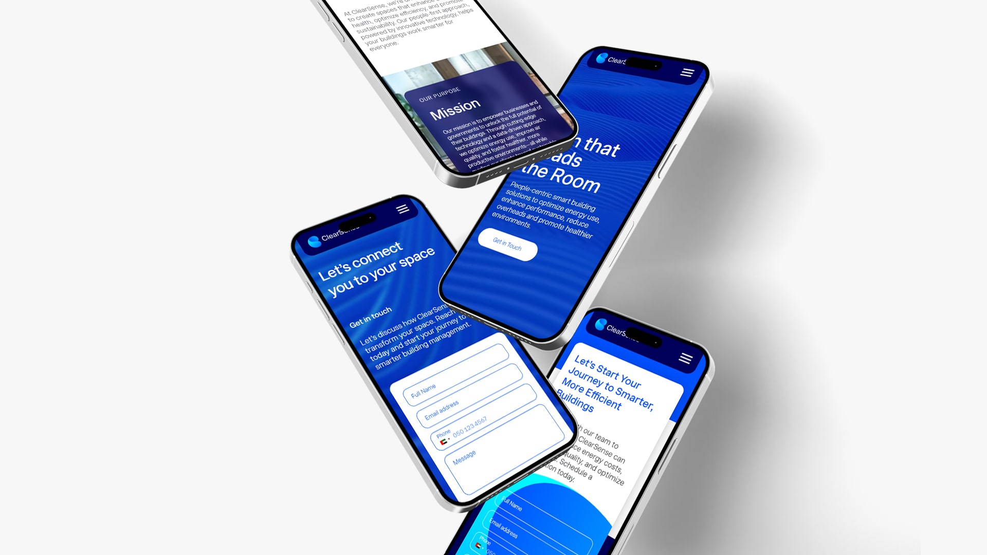
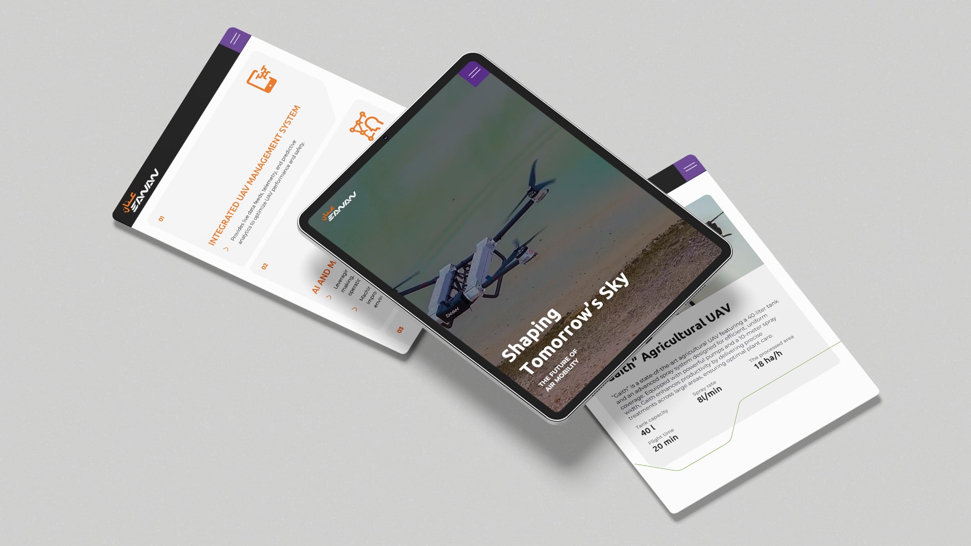
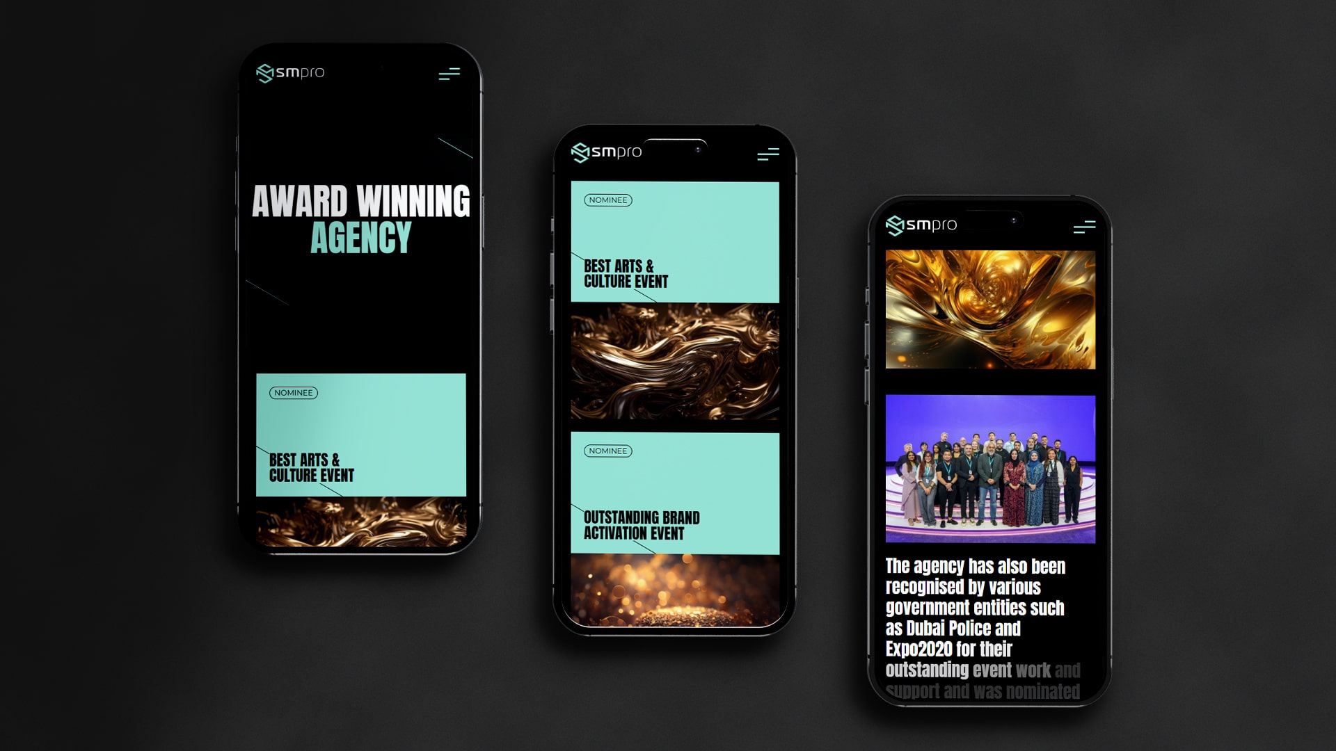
Depending on the set of platforms the website is being developed for, UI designs can be subject to alteration. However, a cross platform UI design should include some of the very identifiable features that represent the brand of the product. This should be maintained throughout the user interface designs, so that any two users on different platforms or devices, find the content easily recognizable. It is hence, crucial to have a well-selected style guide as well as a visual demonstration of the website or application’s appearance and functionality.
To reach all users who are seeking a cross platform experience, creating a website built for a single digital platform is not only insufficient but also ignorant. The UI team should direct more of their effort towards creating experiences that are far bigger in scope, with different platforms serving different functions while maintaining common brand ground with one another, effortlessly. As a result, UI designers are also required to have a deeper awareness and substantial knowledge of all the platforms that the target users prefer to use and the channels they’re most likely to interact with.
Developing a Cross Platform UI Design:
While we are here, let us also discuss the major points to keep in mind while developing a cross platform UI design.
- Consistency in Brand Identity- Customizing the website or app to maintain the brand identity by restricting the design to the chosen colour palettes, and making it look the same on all platforms, irrespective of the touch or display area of the device, or variety of Operating Systems (iOS, Android, etc).
- Follow the Brand Convention- When one changes the device they are working from, a less portable (desktop) to a more portable one (mobile), the important features that can be glimpsed on a wider page should still be available in scrolling format on the phone, with the mega menus, navigation breadcrumb links etc. available more compactly, and the browsing must be seamless.
How to Develop a Cross Platform UX Design:
It’s a Herculean task to be a UX designer in an environment where everyone uses the internet in a very self-acclaimed manner, through multiple and varied physical platforms. To be able to provide consistent, user-friendly cross platform experiences across all these various devices becomes challenging. In a study conducted by Google, website interactions on desktops, last for an average of 43 minutes, while on smartphones, they last just 17 minutes. As a result, potential clients can be lost due to the app’s poor device adaptability and appearance.
To get the user interface and user experience to work perfectly together, the UX designers need to redesign an app or website in such a way that the typeface, body, and all graphics are compatible with the device being used. In some respects, tailoring each cross-platform experience for various target devices would be the ideal cross platform UX design and strategy. There are, however, very frequent misgivings observed in cross platform UX Design, owing to reasons like the different sizes of the operation software of multiple devices, their features, and formats, and also while catering to devices that have their exclusive OS variants like OnePlus.
Aligning the visual dynamics, graphics and interactivity as well as overall complexity like branding, photography, and fonts are required, to make the contents of a website look fitting to every new platform. The major divide is due to the sole reason that the UX strategy for all of the users’ needs and requirements need to be on point even though they are potentially split across different devices and their use of only certain platforms.
- Maintaining typographic consistency – developing cross platform UX design using both platform-specific fonts, or designating just one primary minimalist font type for simplicity, ease of comprehension and compactness.
- It is also helpful to keep the website colours constant and immediately recognisable as the brand. The colour scheme is what makes an app or website experience the most easily identifiable.
- Utilize brand-specific icons for all the cross platform UX designs, in all projects. UX designers have an access to a library of icons, but one should be careful to choose the right ones for each platform and make sure they appear properly.
- Maintaining accessibility – different systems have unique attributes to establish the ease of website access. Some devices allow more of the same feature, such as font size, and zoom capacity, depending on their in-built features.
Conclusion:
The goal is to offer a user-friendly cross platform UI/UX design and branding thus, an experience that is compatible and seamless, with all devices. Whether it’s a smartphone, laptop, tablet, smartwatch, or Smart TV, being used, it should be able to carry out its intended function. The task of the User experience designer is to attempt to closely resemble the efficiency of web site’s performance in multiple platform variations.
For more such services, connect with GTECH.
Related Post
Publications, Insights & News from GTECH