How To Optimize Your Website’s Typography For Better Readability
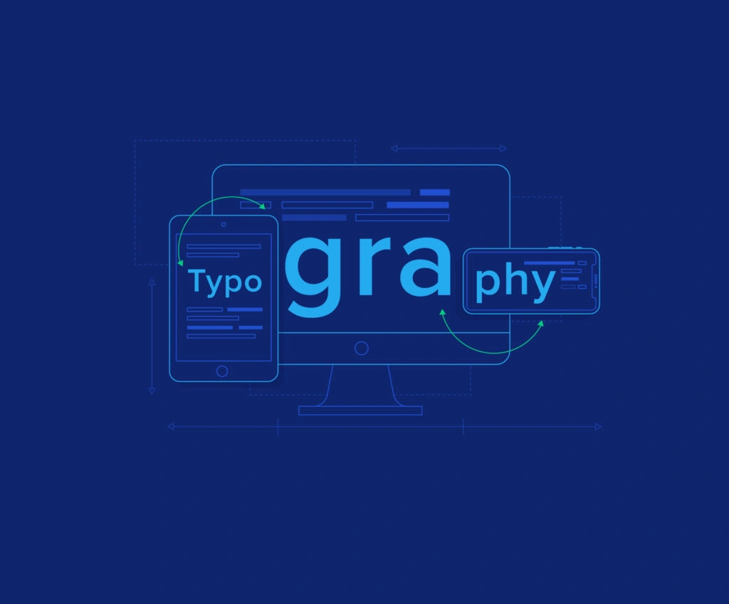
Readability is one of the crucial aspects of web design usability. Understanding content readability and how to measure it effectively can make a significant difference in your website’s performance. Great web typography is one of the underrated aspects of web design. Finding the right balance between what looks good and what reads well is a challenging task. Let us outline some of the common challenges when it comes to typography for web design. This gives you a view of the principles and objectives to help you understand web typography in depth.
Principles of web typography that a designer needs to be aware
The general objectives are great, but the practical insights are even better. To produce the most succinct and readable typography for the best UX design, designers need to follow expert-approved principles.
Restrict the number of interfaces
The UI gets visually more confused the more interfaces you have on a page. If your aim is to use a standard font size for your website and make it readable, limit the number of interfaces. Most designers recommend sticking to 2 to 3 interfaces to restrict the clutter on the screen.
Additionally, it is advised that typography designers use the same fonts for all of their elements.. They need to have a concise idea of how many fonts a website should have, and they should not be used interchangeably.
Choice of colours wisely
It is important to be aware of the difference between web design and web typography design. But if you want to develop your skills in typography, learning the basics would be helpful. A mistake with colour and typography is the poor pairing of the background colour with the font colour. They need to complement each other but also have enough contrast so that the words do not blend into the background.
In general terms, the colour pairings that work best for web pages are black and white. Due to the common issue of colour blindness, it is better to avoid red and green since other complementary colours work well. The text should always be the darker colour and the background lighter unless you are working in a dark principal mode where the case is reversed.
Sticking to 40–80-character lines
When it comes to inserting large bodies of text, there has to be some restriction on line length. You do not want the users to be bombarded with heavy chunks of text. So, use a standard font size for the website and ensure that the text is spread evenly. A 40–80-character limitation works best.
With white space, line length also needs to be balanced well. In recent years, this has become a trend as the use of mobile phones has skyrocketed. The typography on the web page shines out more when there are white lines added between spaces of text, making it easier to read. This makes the content skimmable, and readers are able to pick out important facts.
Use sans serif for blocks of text
Serif fonts are fonts that have little decorations or curves at the tips of each letter. This is not what you want in a digital typeface, as it can distract from what the words are saying.. A few of the easy sans-serif fonts include
- Arial
- Calibre
- Roboto
- Futura
- Helvetica
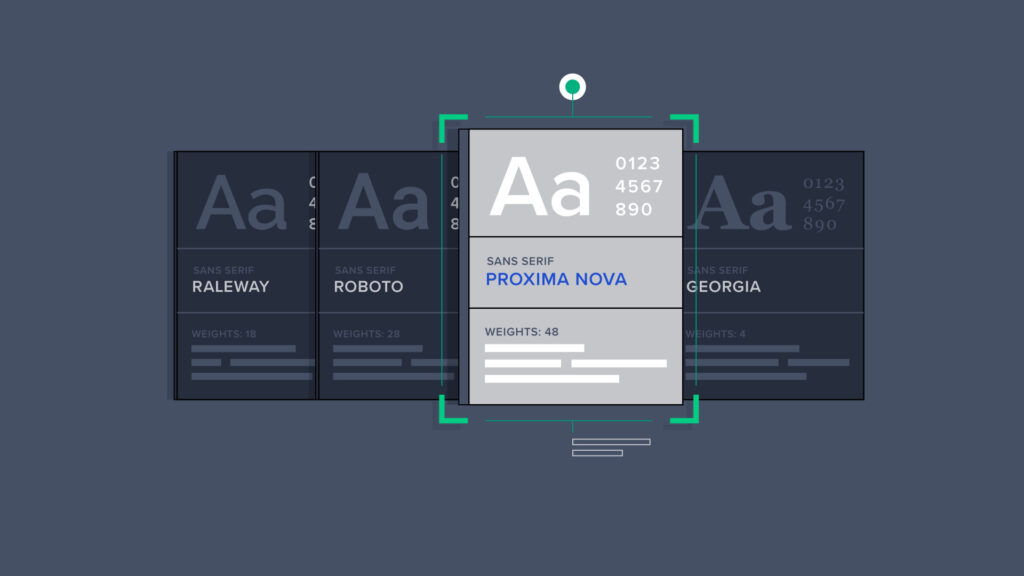
Sticking to standardized fonts
The unique, non-standardized fonts are cooler and perhaps more interesting. But they may not be accessible for certain types of technology or different-sized screens. You need to have an idea of exactly how many fonts a website should have before choosing a standardized font.
A smart move is to continue with standardized fonts. In doing so, you will be assured that everyone who counters them will see your web typography in exactly the same way as you designed it. In addition, there is an array of standardized fonts that look equally good as non-standard ones.
Proper test readability
The test needs to be undertaken time and time again. Studies indicate that there are a few sizes that are better than others. Large is obviously better, as it allows the readers to absorb considerable information at a glance, but it should not be too large. You do not want to overwhelm the reader or make them scroll unnecessarily just to get past the main headings.
Sizes 18, 22, and 26 all have a high readability rating. Among them, font size 22 offers the best reading experience. But the font is quite large for mobile screens. Eye-tracking studies show that there is a considerable improvement in the retention of information when the font size is increased to 18.
Even if you go to choose the recommended font sizes, you are not going to be aware of the typography for web design unless you test it on a large number of individuals with disabilities and screens. All the web typography designs need to be rigorously tested by the users before their official publication on the website.

Reducing the use of text animations
While text animations go on to grab the attention of users instantly, there are a few things that detract from readability, like bouncing or moving images. For instance, if you are trying to read a block of text and an annoying graphic is flashing at the same time, you will best understand why it is your best shot at creating legible text.
Animations are great for inserting text into other areas of a website or webpage. It is better that you separate them from the heavy text areas so that people are able to absorb them instantly.
When it comes to every website, typography for web design has an important role to play. It can be a static business or an ever-changing, dynamic online business. Still, a lot of the success goes unnoticed. Still, the objective of a web typography designer
This is an arduous task that requires considerable experience and expertise is not to take the spotlight but rather to make the material acceptable so that readers won’t hesitate to read it. By following the above principles and tips, a web typography designer will do a great job.
Stay connected with GTECH for more valuable and informative blogs like this.
Related Post
Publications, Insights & News from GTECH