
Mastering Website Header Section: Boost SEO & User Experience with Smart Website Structure

When you open a website, the header section is the first part that grabs your attention. This section will contain all the necessary details, and this is where you navigate to various sections of the website. To provide a better user experience, it is necessary that you make this part of the website aesthetically pleasing as well as SEO optimised, including smart use of footer links SEO optimization to boost site structure and search visibility. This part of the website is the first thing that users and search engines see. Now, let’s explore how you can master the website header section for better seo and user experience, and understand the best practices for the website header section. But first, let’s answer the question: What is a website header?

What is a Website Header?
The website header is a strip usually seen at the top of the website that includes the company name, logo, search button, and other components that help you navigate through the website. Every website has this in common. Elements of a website header contain components such as the navigational links to other pages within the website. Just by looking at the header section, you must be able to understand what the website offers. Additional elements of a website header consist of log in or sign up, Call to Action, social media icons, etc. A high-performing website header consists of a clean design.
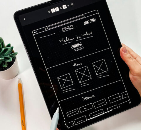
This is what a website header looks like:

A header is important for a website because;
- It’s the first thing on a website that visitors and search engines see. Hence, it creates an impression of your website.
- Elements of a website header contain the table of contents with navigational links to navigate within the website.
- The call to action button in the website header encourages people to take action.
SEO Benefits of an Optimized Header
A well-optimized website header plays a significant role in search engine optimization. An SEO-friendly website header helps search engines crawl and index your site better. Add necessary keywords to the website header. Make sure not to stuff the keywords. The best website header layout for SEO includes a clear navigation menu with keyword-rich links.
Coding of the header also influences the site’s speed. A well-coded header will improve the site accessibility and thereby improve the user experience. Effective header tags SEO involves organizing your material with <h1> for titles and <h2>, <h3> to improve crawlability. Another significant element to consider to make an SEO-friendly website header is mobile responsiveness.
Mobile Responsiveness
Nowadays, most people rely on mobile phones for browsing search engines. With this rise in popularity, it is necessary that you optimize your header and website for mobile phones. Unlike large desktop screens, mobile screens are small, and it is important to consider this size while designing the website. A responsive header adjusts to various screen sizes from mobile phones and tablets to desktop screens. A mobile-friendly design enhances user experience and also makes it an SEO-friendly website header.
Hamburger menu is a common solution to improve mobile responsiveness. A hamburger menu or mobile menu is a common design used in websites. The purpose of this menu is to hide or reveal the menu when a user clicks on it. It is called a hamburger menu because it resembles a hamburger with three horizontal lines. Upon being clicked, the menu reveals and presents the navigational links. Google prioritizes mobile-friendly websites, so a poorly designed website that is not responsive can adversely affect your SEO efforts. Also, make sure that your website loads fast. Loading time can affect SEO. Mobile responsiveness and fast load times are important components for the best website header layout for SEO. Slow-loading websites can lead to an increased bounce rate and a poor user experience.
UX Benefits of a Well-Designed Header
A well-designed website header enhances the user experience. It is important that you maintain a clean design so that the users will not find it frustrating to navigate through it. Along with that, the design must be visually pleasing. Ensure the header contents are easy to navigate with drop-down menus that include categories.
Adding call-to-action buttons improves the rate of conversion. Including the logo of your brand provides a sense of professionalism. Adding a search bar on the website header makes it easier for users to search for what they are looking for. A high-performing website header enhances the user experience and also reduces the bounce rate. The best website header layout for UX prioritizes simple design and clear navigation.
Types of Headers in a Website
Every website has a website header, and the function is always the same. However, the style can vary based on the brands. There are various types of headers in a website. Here are a few Website header examples:
Classic header – Classic header is the basic and one of the common types of header in website. It contains a logo, navigation, links, and a call-to-action button. Such kinds of headers are the most commonly found and they never go out of style.
Vertical Header – A vertical header is typically found on the left or right side of the website. This is commonly used when there are a large number of categories and subcategories.
Hero header – What is the hero section of a website? A hero header appears at the top of the website, accompanied by a large image. It easily grabs the visitor’s attention, and these are commonly found on landing pages and portfolios.
Two-tiered header – Two-tiered header, as the name suggests, comes in two tiers. Elements of a website header, such as the navigational links, come in two lines. This works well for large websites.
Sticky header – The sticky header is commonly found at the top of the website and it doesn’t go hidden after scrolling. You can always see the sticky header at the top of the page. Sticky header allows the users to access the navigational links as and when required without going to the top of the website.
Tips On How To Design Website Header
- Use contrasting colors and fonts to make the header attractive.
- Make sure the header has a responsive design. It should be compatible with mobile devices.
- Including a CTA on your website header will be useful to increase conversions.
- Make sure to make the background of the website darker when you reveal the menus from the header. This way, you catch more attention for the header menu.
- Make the design clean and ensure that it is user-friendly. You can also include small icons on the menu to make it more attractive . This is an important tip to be followed as a bad design can be frustrating to the visitors, and this can increase the bounce rates.
Common Header Mistakes To Avoid
- Adding too many items to the menu can be confusing, and it won’t look good with the design.
- You should not miss out on the search bar or the CTA.
- Mobile responsiveness is an important factor that affects SEO. No mobile responsiveness can cause harm to your website.
- Make sure the website is loading properly. Using large images or videos in the header makes the website slow.
- Inconsistent styling across the website is a big no-no as it creates a poor user experience.
Conclusion
The website header has a significant role in enhancing the user experience and also in SEO. Following the best practices for the website header section ensures the site is user-friendly and SEO optimized. A website header is the first part of the website a user finds, and making it attractive with a clean design is necessary to reduce the bounce rate. In this article, we understood what is website header is, discussed the best practices for the website header section, various types of header in website, SEO and UX benefits of a header, and also discussed the tips on how to design a website header and the common mistakes to avoid.
Related Post
Publications, Insights & News from GTECH