
Image-Heavy Websites (e.g., portfolios, galleries) SEO: How to Optimize for Speed & Search

If your site is packed with photos, case studies, or design work, you already know the struggle: it looks gorgeous, but it loads like a sleepy sloth. Visitors get impatient, bounce off, and search engines notice. That is where website speed for image-heavy sites and smart SEO for image-heavy sites come in. With a few practical tweaks, you can keep all those stunning visuals and still give users a fast, search-friendly experience.
It is important to choose the right images for your website. Choose the wrong one and you either end up with huge files or images that look fuzzy and low quality. Here’s a simple breakdown.
SEO for image-heavy sites [With Multiple Image Formats]
- JPEG (or JPG)
JPEG is perfect for photos and detailed images with lots of colours and smooth gradients. It uses something called lossy compression. Done right, you do not notice the difference, but your pages load much faster.
- PNG
PNG is great for logos, icons, UI elements, and graphics where sharp edges matter. PNG uses lossless compression, which means no image data is sacrificed, so quality stays perfect.
- GIF
GIF mostly has one job: simple animations. It only supports up to 256 colours, which makes it a bad option for photos but fine for small looping graphics, stickers, and basic animated elements.
- SVG (Scalable Vector Graphics)
SVG is different from the others because it is vector-based. Instead of storing pixels, it stores shapes using math. That means it can scale to any size without losing sharpness.
- WebP
WebP is a modern format created by Google and it supports both lossy and lossless compression. It typically produces files that are about 25–35% smaller than comparable JPEGs and PNGs, with no visible drop in quality. Most modern browsers support WebP.
- AVIF
AVIF files can often be 30–50% smaller than WebP while still looking great. Browser support is still catching up, but it is growing steadily.
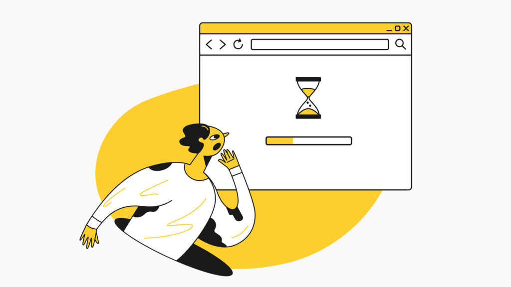
Why speed matters so much for visual sites
If a gallery or portfolio page crawls, visitors rarely wait. They hit back, your bounce rate climbs, and that slowly hurts your portfolio website SEO, along with your lead flow. Search engines keep track of how people behave on your site. Slow load times, frustrated users, and half-loaded pages send the wrong signals.
Strong image-heavy website optimization starts with understanding what makes pages slow in the first place. Large image files, too many requests, and scripts that block loading all pile up. The good news is that you do not have to become a hardcore developer to fix most of it.
Start by making images lighter
A lot of owners quietly ask how to make website images load faster without destroying that crisp, professional look. The secret is to treat visuals like assets that need to be lean and efficient, not bloated. Every extra megabyte puts pressure on website speed for image-heavy sites, especially on mobile networks.
Use the right format for the right job. Photos generally work well in JPEG or WebP, while logos and icons fit better in PNG or SVG. Avoid uploading the huge original straight from the camera. Resize it to the maximum width it actually needs on the page and save that version instead of relying on the browser to shrink it on the fly. This simple step alone can shave seconds off your load time.
Search engines now factor in the overall loading experience, so smart file formats and sensible dimensions have become a core part of SEO for image-heavy sites. When your pages feel quick and responsive, visitors stay longer, click more, and algorithms pick up those good vibes.
Compress images the smart way
For real image-heavy website optimization, start obsessing over file size, not just resolution. Uncompressed or lightly compressed images look nice, but often weigh far more than they need to. Follow image compression best practices by using tools that let you control quality, such as offline photo editors or online compressors.
Aim for a balance where the picture still looks clean to the human eye, but the file size drops a lot. Play with quality sliders until you find the sweet spot. Follow image compression best practices consistently across your site and those savings add up quickly, especially on gallery or case study pages where you show many images in one go.
Use lazy loading to avoid loading everything at once
After slimming files down, the next trick is to only load what the visitor actually sees. Techniques like lazy loading images let the browser delay off-screen content until the user scrolls to it. This stops the page from trying to grab 50 photos at the same time.
This works especially well as lazy loading for galleries where dozens of pictures would otherwise hammer the connection. Above the fold content appears quickly, visitors start browsing sooner, and the rest loads quietly in the background. Combined with thoughtful image compression best practices, this keeps even media-heavy layouts feeling surprisingly snappy on slower devices.
Make images responsive and use better delivery
Your audience is not just on big desktop screens. Phones, tablets, laptops, and huge monitors all show your site differently. If you serve the same giant image to everyone, smaller devices waste data on pixels they will never show.
Use responsive images so smaller screens get smaller versions and bigger screens get higher resolution files. A content delivery network (CDN) can also help by serving images from servers closer to your visitors. All of this directly boosts website speed for image-heavy sites and takes your image-heavy website optimization beyond basic quick fixes.
Caching also matters. Set proper cache headers so returning visitors do not need to download the same hero image every single time. Their browser can reuse what it already has, which makes pages feel instant on repeat visits.
Get your on-page image SEO right
However fantastic your photos may be, search engines do not have eyes to appreciate the beauty. They cannot see your photos. To understand what you are trying to present, they rely on filenames, alt text, and surrounding copy. Following image SEO best practices like giving files descriptive names and writing meaningful alt text helps algorithms figure out what each picture represents. Avoid names like “IMG_1234” and use something like “interior-design-living-room-dubai”.
That matters a lot for portfolio website SEO, where each shot can quietly rank for a service or style keyword.
Think about the overall browsing experience
Real image-heavy website optimization is not just about code and kilobytes. It is also about how visitors move from page to page. If your navigation is confusing or your galleries feel chaotic, people leave even if the site is technically fast.
Winding Up
If all this feels like a lot to handle alone, remember that every small step that improves website speed for image-heavy sites also supports SEO for image-heavy sites and turns more casual visitors into real clients. If you would rather have experts handle the technical and strategic side while you focus on your content, GTECH can step in as a trusted digital marketing agency in UAE and help your image-driven site perform at its best.
Related Post
Publications, Insights & News from GTECH